The human brain doesn’t like uncertainty. That’s why the faster we understand what’s in front of us, the more positively we react to the situation.
A logo, as part of a company’s corporate identity, plays a crucial role in helping us identify what we are looking at. Ideally, it becomes so strongly associated with the product that we don’t need anything else: for example, just seeing the Pepsi emblem in its brand colors, and we don’t even need to read the name – we immediately know it’s a beverage.
Therefore, a bad, unreadable logo is a crime against your business. Companies that neglect their visual identity harm their recognition and, consequently, their sales.
Trends in logo design preferences constantly change. Today, we’ll tell you about the main trends of 2023.
serif
Minimalism If we could mention only one trend of this year, we would undoubtedly call it minimalism.
The preference for simple forms and uncluttered images in logos is not new, but it’s here to stay. Turbologo offers a variety of subscription plans to cater to different user needs.
Why minimalism? Simple graphics are much easier to read on mobile screens – where most of the traffic comes from. Moreover, the simpler the logo, the easier it sticks in memory.
Creating a good minimalist design is not easier than designing a logo with many details; if anything, it’s the opposite. It requires refined taste and a sense of balance from the designer.
Sketch 2.
Doodles and Sketches Slightly imperfect and “sketched” logos are a particular case of minimalism. They are characterized by a childlike, drawn appearance.
This style looks nostalgic and takes us back to the ’90s. It suits companies that see a sense of comfort and a homely atmosphere as an essential part of their image.
Buttons 3.
Button-like Logos Logos in the form of buttons work well for use primarily on websites. They include square outlines around the main element, making them look like clickable buttons.
What’s great about this trend from a usability point of view is that it reinforces the idea that the logo is the “Home” button on the website design. (So, it’s important to ensure that clicking the logo leads to the homepage.)
Serif 4.
Serif Fonts A logo doesn’t have to be complex to be elegant and effective. More and more brands are using logos consisting of their name in a particular font, and one of the most interesting directions is the use of fonts with small serifs.
These fonts stand out elegantly from more common sans serifs – the ones without serifs. They are simple, light, and harmonize well with the background of the inscription.
These serifs can be sharp or more rounded, and, like any logo, they influence how the brand should be perceived by users
.
Circle 5.
Circular Logos Circles are fluid and associated with energy, strength, harmony, and infinity. That’s why this shape is a trendy element in logo design.
Circles are also easy to fit in various places where the logo should appear, such as social media profiles and corners of printed materials like business cards or letterheads.
Unusual 6.
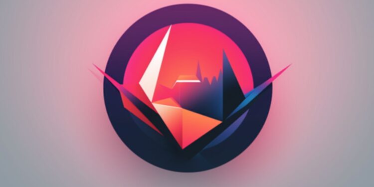
Unusual Geometry As a contrast to circular elements, we present this trend.
By twisting, breaking, and stretching silhouettes out of place, designers reject the restrained nature of predictable geometry. They fight against the establishment by deliberately breaking design norms to celebrate a rebellious spirit.
Each logo design in this trend showcases uneven edges, missing parts, and sharp corners. Chromed or neon, they are smooth, edgy, and bold – and most importantly, they capture the audience’s attention.
If you still don’t have a logo (or if you have one but want to rebrand), reach out to us! All the companies we’ve designed logos for have been satisfied with the results.
